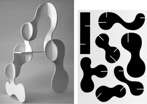
Had a thought this morning about this image — I had bookmarked it earlier for my thesis publication, was attracted to the idea of text written on the panels, and the way you could connect and link them, building a 3D structure. This morning I was thinking of it in terms of a playful work and image game. Did some little tests in paper to start:


I’m not sure the image portion is working all that well… And the paper was too flooppy. I made a version with squares cut from thicker paper:


Still like the words — it almost doesn’t matter that the orientation is sometimes off. The words were semi-randomly chosen from a song I was listening to, and from flipping randomly through a book.
Thought about adding colour and patterning, tried rounding corners:


The images still really aren’t doing it for me! And the words end up sometimes facing half an image anyways. Thinking I’ll just do all words/phrases. (This is getting further and further away from what people attending a comic festival might like, but oh well…)
Oo, perhaps I could intersperse them with a square of image, perhaps? Get rid of the ‘half’ symbol concept, and just integrate a texture/picture on a square?