The past week we were looking at artistic/creative influences in class and discussing them. Perhaps (probably) related, I’ve been looking back to older artists recently when I’m drawing, and sometimes actively studying them. Here’s a selection:
I love the dark, mysterious atmosphere in these paintings, that kind of glowing light, as if a small ray of light is breaking through the clouds to spotlight the entrance to ruins, and the depth of the shadows. And these mysterious women/people just in the frame, small amongst the landscape — who are they? Perhaps it’s the influence of video games, but with these I just want to step in and explore these worlds, and discover their secrets.


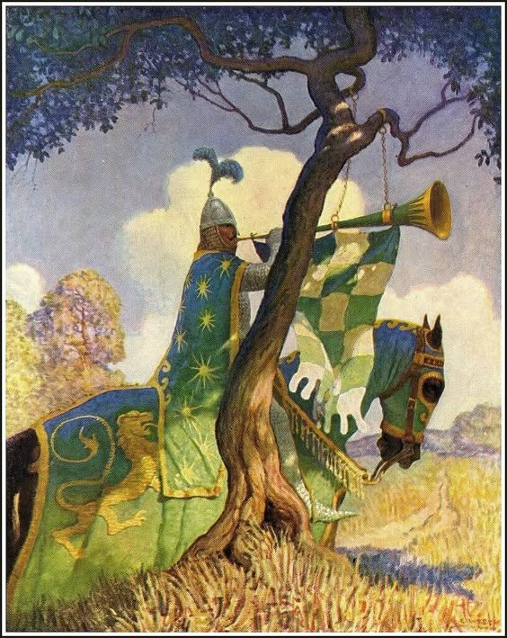
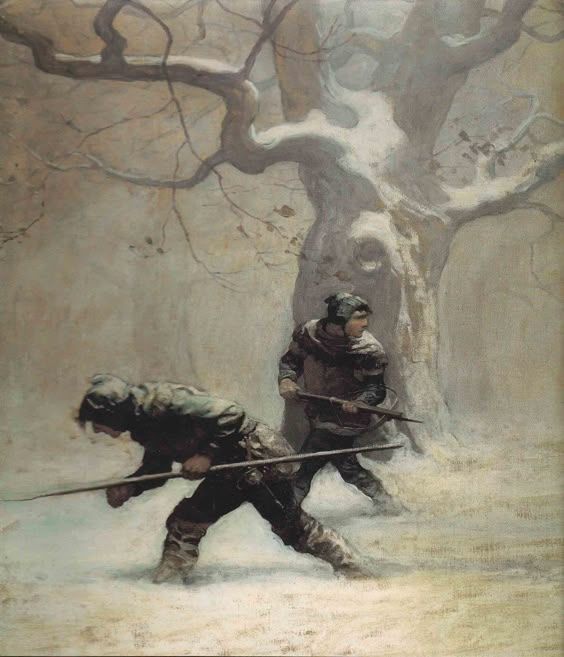
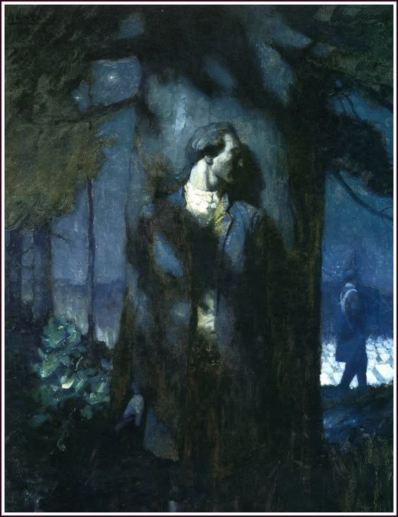
Wyeth is another quite well-known ‘Golden Age’ illustrator, but I was actually not very familiar with his work. It does feel of the time — fairly realist, and much of the work I’m seeing is for narratives. But again, I find myself really enjoying the use of lighting. The knight/herald’s clothing is fabulous (the stars! the check! the wobbly fringe!), but the shadow on his figure against the bright afternoon sky, the accents of dappled light? Yes. Same with the other two — super use of tone and atmosphere to show the hazy, foggy morning or the blue-tinged nighttime.
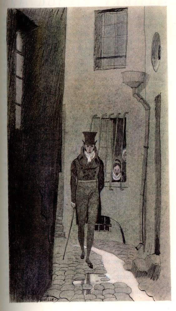
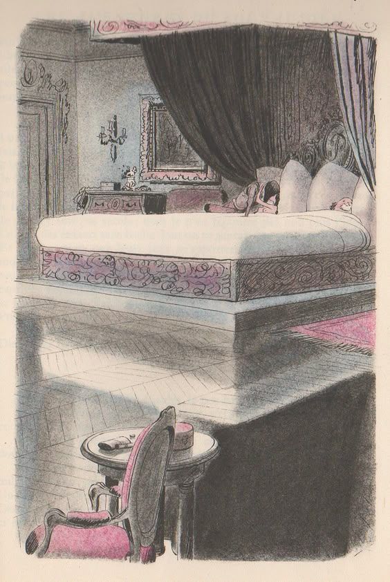
Beuville is slightly later than the other two, getting started in the 1920s. His work ranges in style, more than the images I’ve chosen to share here, but throughout it all is a great economy but also expression in his marks. Like, look at the bustling movement of the woman running’s black skirt, and then the simplicity of how he’s drawn the nude woman on the left. But there’s still expression! In other paintings I haven’t included here, it just looks like he lays down two blocks of colour and out comes an expressive, fully fleshed-out character. How?! He makes it look easy — they’re not at all fussy portrayals of characters — but it’s really not. I also find we (myself, and what I’ve noticed in student work) often have the urge to really try and render, or give detail, to character’s faces (unless blocking/roughing them in) because they’re so important; I feel like it takes guts to opt not to do that, and just indicate a brow, nose and jaw so simply. Or even to decide that the characters will be actually quite small in the image, even! Anyways, Beuville just looks like he’s having fun when he paints/draws. And I can absolutely see him as an influence for contemporary visual development artists today.

There’s lots more, of course, but these are a couple ‘illustrative’ points of reference I’ve been looking at recently.